Crafting an OTP component with React.js
One Time Password Frontend component.


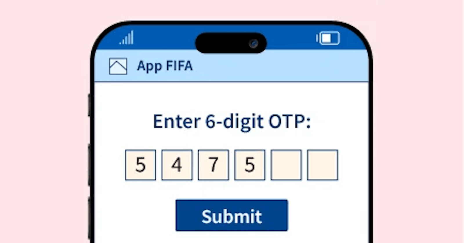
In the age of technological advancements, a frequent situation is encountering the one-time password (OTP) input component in our daily use apps and web-apps, ensuring secure authentication. In this blog, we'll explore how to create the Frontend of a sturdy and user-friendly OTP input using React.
Absolutely! Before we jump in, let's take a moment to understand the easy steps we're about to follow. This blog is going to be a breeze, like squeezing a lemon. Ready? Let's make this super simple and fun!
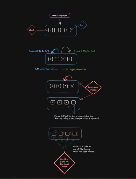
Here are the features we aim to implement in the OTP component:
Seamless Transition: Shift focus to the next input box automatically upon user input.
Backspace Handling: When the Backspace key is pressed, move focus to the previous box while deleting the current box's input value.
Arrow Navigation: Navigate through the input boxes with ease using the arrow keys, both forward and backward.
Click and Focus: Clicking inside any box instantly shifts the focus to that specific input box, streamlining user interaction.

Here's how we'll structure the OTP component:
Our component will feature a clean design with four(dynamic, can be changed via prop) input boxes for entering the authentication code. Users will input the code into these dedicated boxes, providing a straightforward and user-friendly experience.
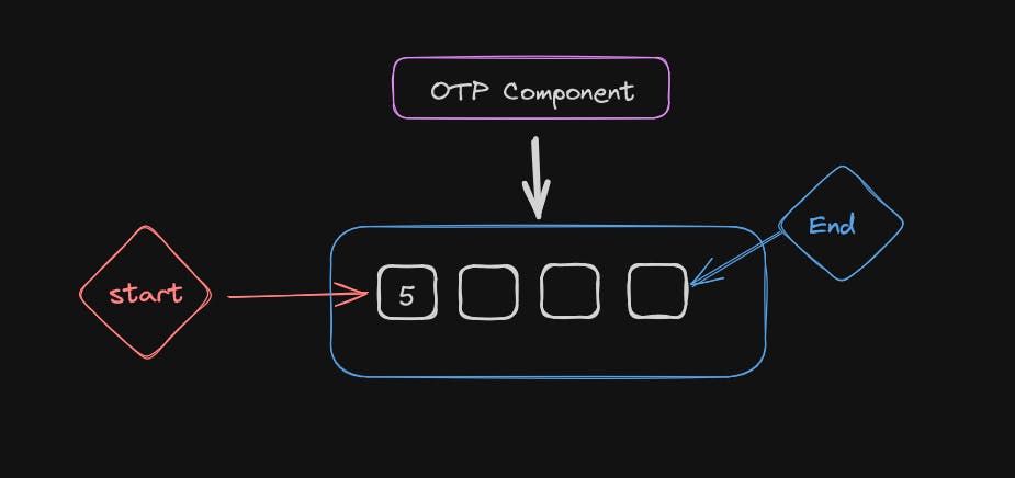
The number of boxes can be adjusted according to the length of the authentication code.
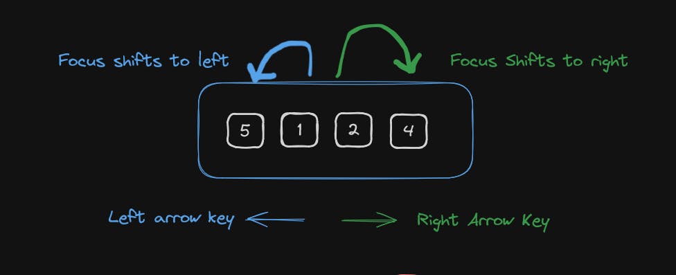
When you press the left or right arrow keys, the focus will smoothly move to the adjacent input box – left when pressing the left arrow and right when pressing the right arrow. This ensures a user-friendly and intuitive experience.

When you press the Backspace key, the current input box will instantly clear its value, and the focus will shift to the input box with the previous index. This functionality makes it convenient to correct entries while maintaining a smooth flow.
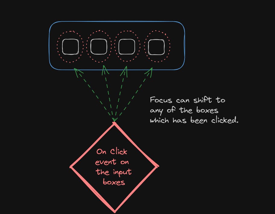
When you click on any input box, the magic happens! The focus smoothly shifts to the box you clicked on. It's like giving each box a little attention, making the user experience friendly and interactive.
Find the working code here and later we are going to break it down to understand in a better way.
We are creating an array of length of the allowed input length of the OTP and then we are mapping the elements of the array to the useRef.
Q - Why to use the useRef hook and not state?
Two major rules to use useRef instead of states in the React.
Change in refs value do not trigger a re-render of the component.
When the value of a ref changes, it doesn't automatically cause the component to re-render. This property makes refs suitable for holding mutable values that don't need to trigger a component update.
Refs can hold the value in between the renders where useState by default cannot.
refs persist their values between renders. Even if a component re-renders, the value stored in a ref remains intact. This behavior is in contrast to useState, where the state gets reset to its initial value on each render.
  // Creating Input Refs Array:
  // Creating an array otpInputs of length allowedOtpLength using Array(allowedOtpLength).
  // Filling the array with null values using .fill(null).
  // Mapping each element to a useRef(null) to create an array of React refs, one for each OTP input box.
  const otpInputs = Array(allowedOtpLength)
    .fill(null)
    .map(() => useRef(null));Building the Component Structure
1. Setting up Inputs:
Create an array of refs using
useRefto access individual input elements.return ( <div> {otpInputs.map((inputRef, index) => ( <input key={index} type="text" className="input_box" maxLength={1} ref={inputRef} onChange={(e) => handleInputChange(otpInputs, index, e.target.value)} onKeyDown={(e) => handleKeyDown(otpInputs, index, e)} onClick={() => focusInput(otpInputs, index)} /> ))} </div> );
2. Rendering Inputs:
Map over the array of refs, rendering an input element for each digit:
Set a
maxLengthof 1 to restrict input to single characters.Attach event handlers for input changes and key presses.
Implementing Navigation and Handling
export const focusInput = (inputs, index) => {
  inputs[index].current.focus();
};

export const handleInputChange = (inputs, index, value) => {
  // Move to the next input on value change
  if (value && index < inputs.length - 1) {
    focusInput(inputs, index + 1);
  }
};
1. Handling Input Changes:
Use the
onChangeevent handler to capture input value changes.Upon entering a digit, focus automatically shifts to the next input box, guiding the user through the process.
  export const handleKeyDown = (inputs, index, e) => {
    // On pressing the Arrow keys, move the focus on the left and right side
    if (e.key === "ArrowLeft" && index > 0) {
      focusInput(inputs, index - 1);
    } else if (e.key === "ArrowRight" && index < inputs.length - 1) {
      focusInput(inputs, index + 1);
    }

    // Move to the previous input on Backspace if not on the first input
    if (e.key === "Backspace" && index > 0) {
      e.preventDefault();
      inputs[index].current.value = "";
      focusInput(inputs, index - 1);
    }
  };
2. Managing Key Presses:
Employ the
onKeyDownevent handler to manage arrow keys and Backspace:Arrow keys smoothly navigate between input boxes, enhancing flexibility.
Backspace not only clears the current digit but also shifts focus to the previous box, offering a natural correction experience.

3. Custom Helper Functions:
Encapsulate common logic like focusing inputs and handling key presses in separate helper functions, promoting code re-usability and maintainability.
For this we have refactored the code and moved the functionality to a separate utility file in a helper folder, which will help to separate the concern between the Component and functional logic.
Key Considerations for a Refined UI

1. Initial Focus:
- Use a
useEffecthook to automatically focus the first input box upon component mount, ensuring immediate user engagement.
2. Click Handling:
- Allow users to click on input boxes to initiate editing, providing multiple interaction methods.
3. Customization:
- Design the component to accept a
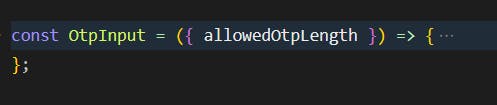
allowedOtpLengthprop, enabling flexibility for different OTP lengths based on application requirements.
Conclusion
By thoughtfully combining React hooks, event handling, and accessibility considerations, we can craft an intuitive and accessible OTP input component that elevates user experience and security within our applications.
To see the complete code and customize it, you can fork the code from here.
OTP Component Code Sandbox
Thanks for reading this article, I will be posting a lot more articles from intermediate to advanced topics in this coming year and we will be unboxing the mystery of web and software engineering in general, from Backend to the Frontend.